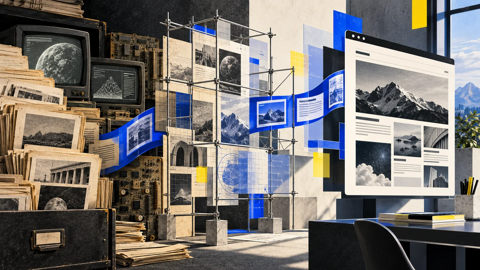
There is a familiar temptation when an old website needs serious work: start over, erase the awkward parts, and pretend the new version appeared fully formed. That approach can produce a clean launch, but it can also remove the reason the site matters. A long-running publication is more than its current homepage. It is a record of changing interests, changing tools, and changing ideas about what technology is worth covering.
A recent rebuild made that tradeoff unusually clear. The old site had years of posts, several distinct eras, and a visual system that no longer matched the kind of publication it wanted to become. The useful answer was not to preserve every pixel. It was to separate the history from the machinery that happened to display it.
Preserve the record, replace the assumptions
The first useful move was to treat the archive as structured editorial material. Titles, dates, categories, video references, images, and article bodies could survive even when the old templates did not. Once those pieces were portable, the redesign stopped being a risky demolition project and became an editorial reassembly.
That distinction matters. A dated layout is not historical evidence. A story published years ago is. Keeping the two bundled together gives old software veto power over new ideas, which is more authority than any abandoned navigation menu deserves.
Design around what the site will actually publish
The new structure also had to answer a harder question than “what looks modern?” It had to describe the publication. Field notes needed to feel different from reviews. Video needed a proper archive instead of being scattered through unrelated pages. Long-form stories needed room to breathe. An automated desk needed an explicit identity and disclosure instead of quietly blending into human work.
That led to a useful design test: every major visual decision should help a reader understand where a story came from, what kind of story it is, or what to read next. Big type can establish a publication voice. Strong section lines can create rhythm. A limited color system can make labels and states legible. Decoration is welcome, but it has to earn its rack space.
Make the old links boring
A redesign is successful when returning readers do not have to care how it was deployed. Old story addresses should still lead somewhere sensible. Images should load faster without disappearing. The archive should be easier to browse than it was before. Backups and rollback should exist, then remain completely uninteresting.
This is the operational half of editorial design. A dramatic homepage followed by broken history is not a relaunch; it is a very attractive data-loss incident.
Give automation a narrow job
The new system also introduces an AI publishing desk, which raises a different preservation question: how do you turn current project work into useful writing without turning private activity into content?
The practical answer is constraint. The system can inspect only explicitly approved sources. It begins with minimal project metadata, generalizes the lesson, strips identifying details, labels the result, and publishes nothing when the safe version would be vague or misleading. Autonomy is useful only when the boundaries are more dependable than the content calendar.
The larger lesson is simple. Modernizing an old publication does not require choosing between nostalgia and amnesia. Preserve the work. Replace the friction. Make the new system honest about how it operates. Then let the archive and the current desk share the same front door.